October 20, 2026
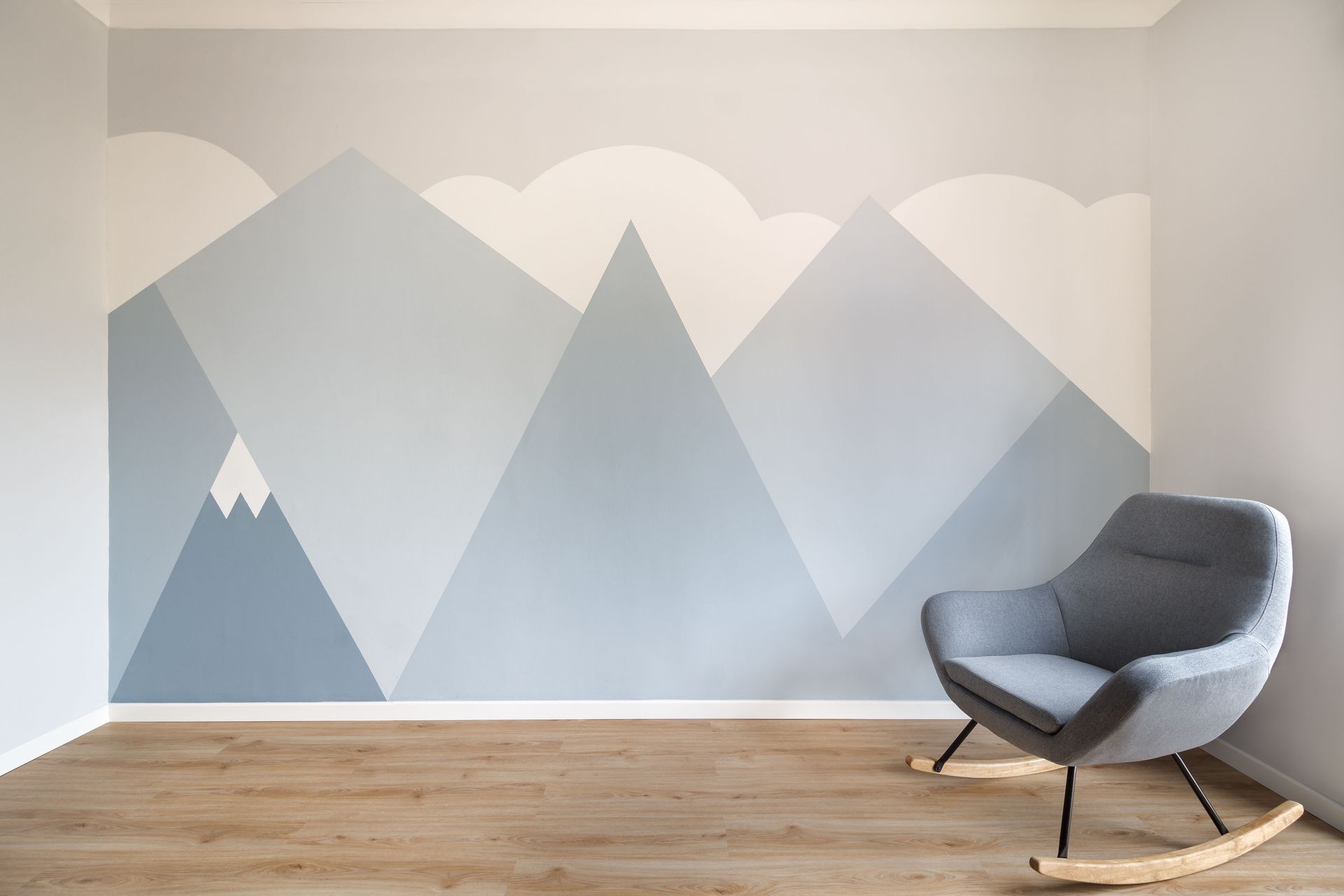
When preparing a home for the highly competitive real estate market, property owners frequently overlook the profound impact that wall colors have on potential buyers. A fresh coat of paint is undeniably one of the most cost-effective strategies to increase a property's overall appeal, but picking the right hue is critical. Vivid, highly personalized colors might reflect your unique personality, yet they can easily alienate buyers who struggle to visualize their own furniture in the space. Neutral tones become an invaluable asset here. Neutral shades act as a pristine blank canvas, allowing prospective buyers to easily picture their future lives within those walls. Many top-tier painting companies recommend opting for soft grays, warm beiges, and crisp whites to create a universally appealing environment. According to Gitnux, 60% of homeowners choose neutral colors to improve resale value. By prioritizing these versatile shades, your interior painting project yields optimal returns.
Understanding the Psychology of Neutral Shades
Colors hold a remarkable and well-documented power to naturally influence human emotions and drastically shape our physical perceptions of a living space. When potential buyers first walk into a room, their immediate emotional reaction often dictates their overall interest in the property. Neutral colors consistently evoke deep feelings of calm, cleanliness, and serenity. These are exactly the positive emotions you want a prospective buyer to experience during a tour. Bright reds or dark purples can cause visual fatigue or unnecessarily induce anxiety, whereas a soft beige and a light gray actively promote a profound sense of relaxation and structural stability. Reputable painting companies understand this psychological dynamic perfectly and frequently advise their clients to utilize these calming tones. Furthermore, neutral shades expertly eliminate visual clutter, effectively making confined spaces appear significantly larger, brighter, and much more open. Applying this psychological approach to your home is highly effective.
Choosing the Right Undertones for Your Home
While many people mistakenly believe that all neutrals are simply plain or entirely devoid of character, every single gray, white, and beige contains specific underlying tones. These undertones drastically affect how the color appears in different lighting environments. An undertone is the subtle, often hidden hue that lies directly beneath the primary surface color, and it can lean warm, cool, or perfectly neutral. A seemingly basic gray might unexpectedly reveal strong blue, green, or even purple undertones when applied to a large wall. If these hidden tones happen to clash with your expensive hardwood flooring or your custom cabinetry, the entire room can quickly feel disjointed and unappealing to visitors. This specific complexity is exactly why highly experienced painting companies strongly recommend testing large paint swatches directly on the walls before fully committing. By carefully analyzing these subtle shifts, you pick a neutral shade that beautifully harmonizes with your home's unique architectural elements.
Highlighting Architectural Features With Subtle Contrasts
Neutral colors provide an absolutely excellent, low-risk opportunity to skillfully draw attention to your home’s most beautiful architectural details without unnecessarily overwhelming the buyer's senses. Instead of heavily relying on jarring, highly contrasting colors that might easily distract a visitor, you can strategically use varying shades of neutral hues to organically create depth, dimension, and visual intrigue. For example, painting the primary walls a soft, inviting beige while coating the baseboards and elegant window trim in a crisp, bright white instantly makes those premium features pop. This subtle but effective contrast naturally guides the buyer's eye directly toward the superior craftsmanship and overall quality of the home. Moreover, professional painting companies frequently use this exact styling technique to beautifully accentuate high vaulted ceilings and custom shelving units. You can also carefully apply a slightly darker neutral shade to an accent wall, adding substantial visual interest to a primary living room.
Comparing Warm and Cool Neutral Paint Options
The ongoing debate between warm and cool neutrals is an incredibly essential consideration when meticulously preparing a property for the modern housing market. Warm neutrals, such as traditional beige, soft cream, and earthy taupe, primarily contain yellow, orange, or red undertones. These specific colors effortlessly create a cozy, highly inviting atmosphere that works exceptionally well in family living rooms, comfortable bedrooms, and spaces featuring natural wood accents. Conversely, cool neutrals like crisp white, sleek ash gray, and soft greige contain distinct blue, green, or subtle purple undertones. Cool tones consistently impart a remarkably sleek, distinctly modern, and visually refreshing vibe, making them absolutely ideal for newly renovated bathrooms and contemporary kitchens. Many highly rated painting companies frequently suggest thoughtfully blending warm and cool neutrals to achieve a perfectly balanced, universally appealing aesthetic. This hybrid approach seamlessly offers the modern crispness of a cool gray alongside the inviting warmth of beige.
Identifying the Best Finishes for High Traffic Areas
Once you have confidently decided on the absolute perfect neutral hue for your space, thoughtfully determining the appropriate paint finish is the next critical step in the process. The specific finish, or sheen, not only drastically affects how the chosen color naturally reflects ambient light but also directly dictates the long-term durability and practical washability of the newly painted surface. Matte and flat finishes absorb light beautifully and excel at completely hiding minor wall imperfections, but they are notoriously difficult to effectively clean without causing damage. Therefore, they are always best reserved for low-traffic zones like formal dining rooms or quiet adult bedrooms. For busy hallways, highly utilized kitchens, and active family bathrooms, reputable painting companies generally advise using practical eggshell or satin finishes. These highly versatile sheens successfully offer a slight, appealing luster that beautifully enhances light neutral colors while simultaneously providing a highly durable, easily washable surface for your busy family.
Maximizing Natural Light Through Color Choices
Abundant natural light is consistently ranked by real estate agents as a highly desirable feature a home can possess, and your paint color choices play a massive, undeniable role in maximizing this valuable asset. Dark or deeply saturated colors aggressively absorb incoming sunlight, immediately making standard rooms feel significantly smaller, noticeably darker, and much more confined. Conversely, light neutral colors inherently possess high Light Reflectance Values, meaning they naturally bounce beautiful sunlight around the room, instantly and dramatically brightening the entire space. A pale, sophisticated gray or a soft, creamy white can dramatically transform a historically dim, north-facing room into a remarkably airy, highly inviting sanctuary. Leading painting companies frequently recommend intentionally utilizing high-reflectance neutrals for extensive interior painting tasks to significantly enhance the natural luminosity of a typical home. By intentionally leveraging pale hues, you can easily create a vibrant, brilliantly sunlit environment.
Preparing a home for a fast, profitable sale requires strategic decision-making, and updating your exterior painting and interior wall colors is undeniably one of the most impactful, cost-effective investments you can make. By deliberately opting for soft, versatile neutral shades, you effortlessly create a pristine, welcoming blank canvas that allows prospective buyers to envision their future living happily in the space. Understanding the proven psychological benefits of calming tones, carefully evaluating the subtle differences between warm and cool undertones, and properly utilizing gentle color contrasts all contribute heavily to a highly successful and profitable interior painting endeavor. Picking the optimal finishes guarantees that your freshly painted walls successfully maintain their flawless, pristine appearance throughout the entire selling process. Working with knowledgeable, highly experienced exterior painting and interior experts streamlines this entire demanding undertaking. Secure your market advantage, update your hues, and reach out to Henderson Painting today for your next professional upgrade.